When developing web-apps for mobile a need that we encounter sooner or later is to supply specific styles to certain elements when the device rotates either in portrait or landscape mode.
Being a CSS need the first method we will likely find while googling the subject is a CSS approach which uses the famous media query feature orientation, so if for example we are developing an android holo-like top bar and we want it to shrink a little in landscape we’d write something like this :
#top-bar {
    background : red;
    height : 48px;
}

@media all and (orientation: landscape) {
    #top-bar {
        background: purple;
        height: 38px;
    }
}
And that’s it, right? Still I did noticed something curious thanks to the big screen of my Galaxy Note 2 and its Multi Window feature.
How CSS media query orientation works
My assumption was that the media query would ask the device accelerometer its current state and based on that discern whether to apply or not a portrait or landscape based media query’s rules, but giving a peek to the W3C specs on paragraph 4.5 about media queries reveals that this unexpected behavior is “almost” the correct one :
The ‘orientation’ media feature is ‘portrait’ when the value of the ‘height’ media feature is greater than or equal to the value of the ‘width’ media feature. Otherwise ‘orientation’ is ‘landscape’.
@media all and (orientation:portrait) { … }
@media all and (orientation:landscape) { … }
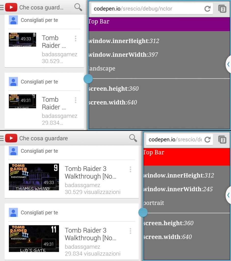
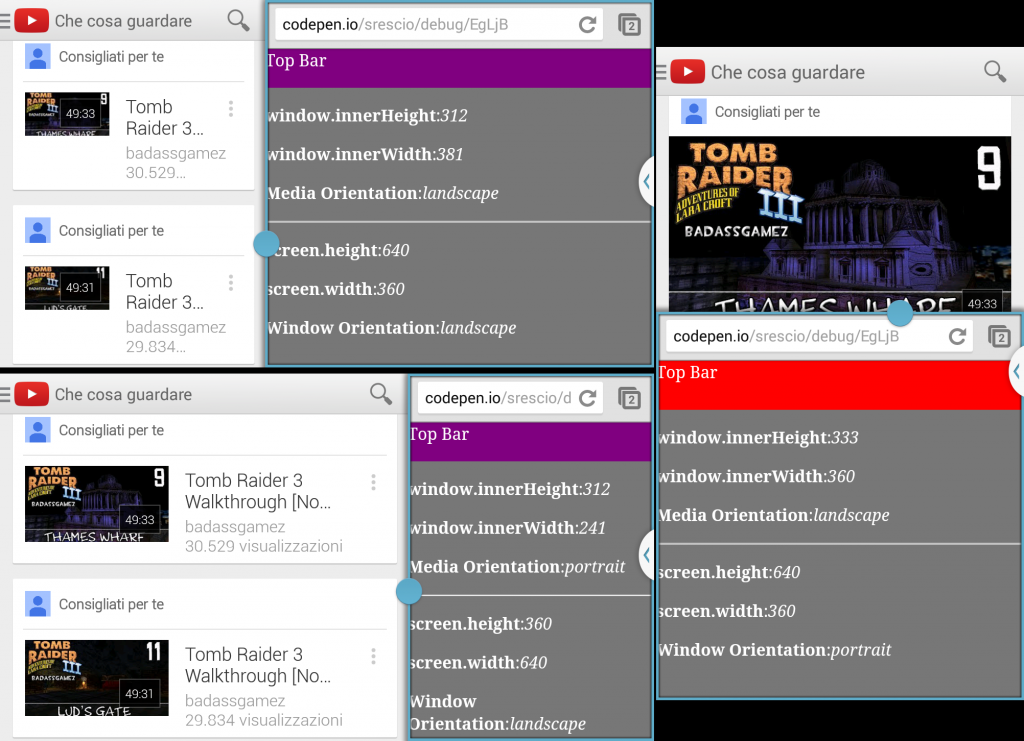
The height and width media features are equal to the window.innerHeight and window.innerWidth javascript properties which reflect the browser window size not the actual device screen size, which means that the media query might assumes that the “orientation” changed when in fact it didn’t.
This logic probably assumes that on mobile devices the browser window always fills the whole screen available space, for that the limited screen size will only allow the execution of one application at time. This was true until the Phablet category was introduced, and tablets too on Android are adopting a multi-tasking approach that is similar to the one used on the desktop featuring multiple windows.
This gives me an undesired result, because the Holo styled apps on Android enabled for the Multi Window will keep their portrait/landscape styles of the top bar regardless of the ratio between height and width available to them, instead our web-app if shrank enough will believe to be in portrait mode and increase the top bar size and effectively steal away precious vertical space.
This behavior also applies when an input or textfield has focus and the virtual keyboard is displayed, the vertical size occupied by the keyboard is subtracted from the window height thus triggering all media queries, again without a real device orientation change.
You can try playing around a little with the following example both on desktop and smartphone to see what I’m saying :
1
Handling orientation with javascript
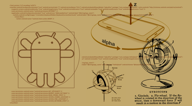
On touch enabled devices, both tablets and smartphones which also feature in most cases the accelerometer, the DOM window object has a property called orientation, that as the name suggest can be used to discern which orientation the device is currently facing.
Notice that differently from the CSS property, where we would name the orientation we want to target, the window.orientation property returns an integer value that represents the degree value of the window tilt respect to the default mode of the device which is always represented by 0.
Following a clockwise continuous rotation, on a typical smartphone we can have the following four situations :
|
case |
window.orientation |
visual |
|
|
|
vertical default |
0 |
portait |
|
|
horizontal clockwise |
-90 |
landscape |
|
|
vertical reverse |
previous value or 180 |
previous orientation or portrait |
|
|
horizontal anticlockwise |
90 |
landscape |
Here we have a coupe of things to notice, I referred to 0 as the default orientation, which may not always correspond to portrait. On some tablets, like the Galaxy Tab that by design is intended to be held in landscape mode for normal use, when queried the window.orientation will most likely return 0 for landscape, and that is because the manufacturer decided that the device should be used that way.
Also during the rotation it may happen on some devices that the horizontal values may not change its value sign, keeping to report 90 or -90 for both clockwise and anti clockwise horizontal positions, and the vertical reverse value of 180 degrees may not be triggered at all.
Given these facts we can address the issue with the following JavaScript :
function setDeviceOrientation() {
    var isAxisDefault = window.orientation===0 || window.orientation===180,
        orientation   = (isAxisDefault)?'portrait':'landscape';

    $('html').attr('data-orientation', orientation)
};
setDeviceOrientation();

$(window).on('orientationchange', setDeviceOrientation);
We check to see if the 0 or reverse values are met to define the orientation variable to portrait, otherwise we always define it as landscape regardless of the sign the device is returning about it, and finally we set the data attribute.
This will match with the following SASS :
#top-bar {
    background : red;
    height : 48px;
}

[data-orientation="landscape"] {
    #top-bar {
        background : purple;
        height: 38px;
    }
}
Device orientation and iFrames
If the code above is executed inside an iFrame the window.orientation value will always return 0 because only the top frame of the page is informed about the device orientation change. This can be easily solved when the Parent and Children frames are both in the same domain by using inside the Child iFrame the parent object to access the DOM of the Parent frame, otherwise we will incur in a cross-origin security error that will prevent us to tame into the Parent DOM.
If the frames happen to be on different domains but we do have access to the Parent frame that includes the child, we can resolve to HTML5 postMessage feature in order to inform the Child iFrame about changes happening in the parent window.