Many years were needed for developers to abandon tables as a mean to construct web pages layouts and switch to more semantically meaningful elements combined with CSS, but the bad side-effect of the awareness campaign for building flexible layouts with style sheets was the complete demonization of HTML tables and the CSS properties that allow to access their powerful dimensions computing algorithms.
I happen to find more often tabular structures build using div, p, span and other text related tags together with fixed widths CSS structures, which could have been obtained more easily (and efficiently in a responsive perspective) by using the good old table tag that would be perfectly legit in such context.
This deep fear of using tables like they were some kind of antiquated instrument of the past can make us miss the great potentiality that CSS table own, especially for the newest web frontiers like mobile webapps, either for native use with phonegap or alone.
The three vertical elements of a mobile layout
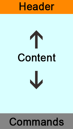 Usually the layout of a mobile application is composed of the following parts arranged in the following order :
- Header
- Contents
- Commands
The Header contains the logo and the name of the app or the current section, then one or more interactive buttons follow. This zone might contains further rows of elements that would push further down the Contents area.
The Commands part may not be always present in iOS and Windows Phone, while on Android it is possible to find it in bottom of the screen even though it is usually placed in the top below the Header.
The middle part hosts the actual Contents that are relevant for the current view, it can be scrolled vertically independently from the rest of the interface elements. However the height of the Contents box has to adapt in order to fill the vertical space between the two sibling elements without setting off screen none of the three.
This behaviour can be easily achieved in a cross browser way with the following HTML :
<div id="Layout">

    <header class="layout-top">
      HEADER.
    </header>

    <section class="layout-middle">
        <div class="outWrap">
            <div class="inWrap">
              CONTENTS.
            </div>
        </div>
    </section>

    <footer class="layout-bottom">
      FOOTER.
    </footer>

</div>
and the following SASS/CSS :
html,
body,
#Layout {
    font-family: arial;
    height: 100%;
    margin: 0;
    overflow: hidden;
    width: 100%;
}

#Layout {
    display: table;

    .layout-top {
        background-color: orange;
        display: table-header-group;
        height: 1%;
    }

    .layout-middle {
        background-color: azure;
        display: inherit;
        height: 100%;
        min-height: 1px;
        width: 100%;
        position: relative;

        .outWrap {
            display: block;
            height: 100%;
            position : absolute;
            overflow: auto;
            -webkit-overflow-scrolling: touch;
            width:100%;

            .inWrap {
                height: 100%;
            }
        }
    }

    .layout-bottom {
        background-color: grey;
        display: table-footer-group;
        height: 1%;
    }
}

// Targets Android legacy stockbrowser
@media screen and (-webkit-min-device-pixel-ratio:0) {
    #Layout {
        .layout-middle {
            .outWrap {
                position: static;
            }
        }
    }
}

// Cancel the above and restore position on Safari 10+
_::-webkit-:host:not(:root:root),
#Layout .layout-middle .outWrap {
    position: absolute;
}
The two elements .layout-top and .layout-bottom, featuring respectively the display:table-header-group and display:table-footer-group properties will compute their own height based on their contents, if there isn’t any the elements will collapse leaving all the vertical space to the central element .layout-middle with display:table like the main ancestor and the property height:100%.
Furthermore the position property is set to relative, this is because the contents will be hosted inside two inner div, the first one .outWrap with position:absolute to allow it to fill vertically all the parent height, which is the dynamic row .layout-middle with display:table, while the nested container .inWrap will expand normally in height based on its contents, and when the contents will exceed the height of .layout-middle there will be the vertical scroll of the .outWrap box in order to not affect the surrounding structure.
Internet Explorer Legacy
If we’re going to apply this HTML/CSS structure for the desktop, the browser that is going to give us most headaches is Internet Explorer of course. Specifically the structure will work as expected even in IE8, which is the most up-to-date version of the browser available for the old systems running with WindowsXP (retired for the joy of all devs the 8th of April 2014), with the following CSS change :
.ie8 {
    #Layout {

        .layout-middle {
            display: table-cell;
            height : auto;
        }
    }
}
The most problematic version is IE9 instead, despite of the following CSS fix it will present an abnormal behavior :
.ie9 {
    #Layout {

        .layout-middle {
            display: table-cell;
        }
    }
}
We will see that the azure Contents area .layout-middle will correctly expand in height between its siblings but no content will appear inside. This issue is caused by the computing of the height at the box-model level, despite the declared height of 100% on the element to expand vertically between its siblings, which is visually respected, the web inspector returns 0 for computed height of the element.
This break the height propagation chain towards the element’s children, as the element .outWrap in position:absolute will have as reference value zero and thus will not be drawn on the screen.
However, if we query the element’s height via JavaScript it will return the correct value, so the only work-around for this strange behaviour is to manually “propagate” via JavaScript the height of .layout-middle and apply it to .outWrap.
//IE detection
$(document).ready(function(){
   var bv = navigator.appVersion;
   var ie = '';

   if( bv.indexOf("MSIE 8.")!=(-1) ) {
      ie = 'ie8';
   } else if( bv.indexOf("MSIE 9.")!=(-1) ) {
      ie = 'ie9';
   } else if( bv.indexOf("MSIE 10.")!=(-1) ) {
      ie = 'ie10';
   }
   $('html').addClass(ie);

   //Fix IE9 layout propagation bug
   if(ie==='ie9') {
      function setHeight() {
         var parentHeight = $('.layout-middle').height();
         $('.outWrap').height(parentHeight);
      }
      setHeight();

      $(window).on('resize', function(){
         setHeight();
      });
   }

});
This way the structure keeps to be ruled by the CSS reflow mechanism.
[codepen_embed height=400 theme_id=1 slug_hash=’bLmGp’ user=’srescio’ default_tab=’result’ animations=’run’]
The three horizontal elements of a mobile header
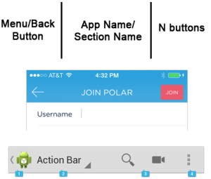 Now that we have the general structure for the app we’ll go into the details of the interface for the horizontal elements. Both on iOS and Android there is a very similar structure composed of three main elements :
- Menu/back button on the left
- App/section name in the middle
- One or more interaction buttons on the right
The structure of this layout is similar to the previous one, the first element on the left is usually with fixed width, while the buttons area on the right has a variable width based on the number and size of the elements it contains, the middle part instead has a flexible width which extends for all the horizontal space between its siblings.
The needed HTML structure will be similar to the previous one :
<nav id="top-bar">

  <div class="top-bar-left">
    left
  </div>

  <div class="top-bar-middle">

    <div class="top-bar-outWrap">
      <div class="top-bar-inWrap">
        <p class="app-name">middle</p>
      </div>
    </div>

  </div>

  <div class="top-bar-right">
    <p class="action-overflow">right</p>
    <p class="action-overflow">right</p>
  </div>

</nav>
The difference is all in the CSS, the main container #top-bar with display:table will have the property table-layout:auto in order to allow the children elements with display:table-cell to adapt their own width based on their contents.
The central element .top-bar-middle will contain a further nested structure of div to allow the correct vertical centering and horizontal expansion of its contents with position:absolute, in this way the size will be ruled by the parent with display:table-cell. This will alow the text elements inside with text-overflow:ellipsis to never exceed the middle container width and to not influence the surrounding siblings.
The width:1% applied on the .top-bar-right element act as a minimum width for the inner contents, which if arranged as separate tags will need to have display:table-cell in order to stay on the same line.
html,
body,
#top-bar {
  font: 16px Arial;
  height:100%;
  margin:0;
  padding:0;
}

#top-bar {
  display:table;
  table-layout:auto;

  > * {
    display:table-cell;
    position:relative;
    text-align:center;
    vertical-align:middle;
  }

  .top-bar-left {
    width:40px;
  }
  .top-bar-middle {
    vertical-align:top;
  }
  .top-bar-right {
    width:1%;

    .action-overflow {
      display:table-cell;
    }
  }
}

.top-bar-outWrap {
  display:table;
  height:100%;
  position:absolute;
  table-layout:fixed;
  width:100%;

  .top-bar-inWrap {
    display:table-cell;
    vertical-align:middle;
    width:100%;
  }
}

.app-name {
  overflow:hidden;
  text-overflow:ellipsis;
  white-space:nowrap;
}
In this case no JavaScript is needed as the table’s widths are computed correctly without issues on all browsers.
[codepen_embed height=150 theme_id=1 slug_hash=’scIhu’ user=’srescio’ default_tab=’result’ animations=’run’]
The Commands bar on the bottom of the screen
Making the Commands bar is an easy task, both on iOS and Android the elements inside it have variable width that is equivalent to the parent width equally distributed on all children :
<nav id="bottom-bar">

  <div class="bottom-elm">one</div>

  <div class="bottom-elm">two</div>

  <div class="bottom-elm">tree</div>

</nav>
html,
body,
#bottom-bar {
  font: 16px Arial;
  height:100%;
  margin:0;
  padding:0;
}

#bottom-bar {
  display:table;
  width:100%;
}

.bottom-elm {
  border-right:1px solid black;
  display:table-cell;
  text-align:center;
  vertical-align:middle;
  width: 1%;

  &:last-child {
    border-right:none;
  }
}
[codepen_embed height=150 theme_id=1 slug_hash=’lcrKn’ user=’srescio’ default_tab=’result’ animations=’run’]
Combining the CSS tables
The final result of the three techniques combined will give us a flexible structure both in height and width, where we can modify the contents in size and number without anything breaking apart. Furthermore, in this way we can avoid to use the tricky position:fixed which has proved to be unstable on mobile devices under many circumstances. Also we ensure that the scrollbar of the contents will appear only inside the actual content’s area without extending to the whole page.
[codepen_embed height=500 theme_id=1 slug_hash=’mIheg’ user=’srescio’ default_tab=’result’ animations=’run’]