Old saying:
If you never tried to center vertically a text, you know nothing about CSS
CSS tables are the main instrument that browsers, since IE8 included and above, make available to perform basic typographical operations such as center a text vertically inside of a container without knowing the height of the container nor the bulk of the text in terms of font size and number of lines, without them the property vertical-align:middle is pretty much useless.
A typical example is the caption within an image, with a CSS table it’s possible to allow the text to stay centered no matter if it’s a single line or multiple lines, as long as it’s height is less than its container it will remain centered, otherwise the container will grow in height to accomodate the exceeding content.
In this case the effect you want to achieve is that the container caption covers in width the parent container, reason why we apply the width:100% property, and as long as the size of the parent container remains fixed everything works as planned.
[codepen_embed height=500 theme_id=1 slug_hash=’QwpLaQ’ user=’srescio’ default_tab=’result’ animations=’run’]
1px bug
Problems arise on WebKit and Blink based browsers, meaning on all desktop and mobile versions of Chrome, Safari and Opera.
If the size of the parent container is itself variable, meaning set using a percentage unit, you will notice a strange effect: resizing the parent, the child with display:table and width:100% will not overlap perfectly its father at all stages of the resizing process, you will notice instead a sort of flicker of 1px, on the right or left side of the element depending on the type of position and float applied.
In the case of the previous demo, adding an animation helps to grasp better the issue, if the element is in position:relative and with float:right the flickering can be observed on the left side, also it becomes clear how the text “tremble” during the animation due to the size of the box not being calculated correctly:
[codepen_embed height=500 theme_id=1 slug_hash=’GgWpry’ user=’srescio’ default_tab=’result’ animations=’run’]
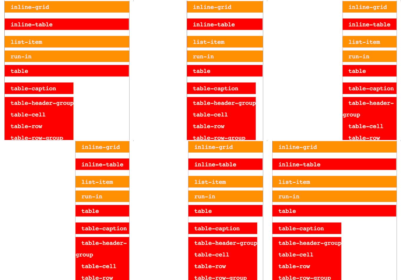
The bug is also illustrated in the following GIF while occurring on the right side, highlighted in red are the elements that use display values of the table type, if the element is in position:absolute the flickering will occur always on the right side of the element even if you apply a float:right, behavior observed in Chrome Mac Version 39.0.2171.95 (64-bit):
The previous GIF is based on the following demo, where all types of display values are tested, using 100% width and animation on the parent container of all elements, here can be observed how all the elements with display value belonging to the table category do not respect the width:100% property, but when the father shrinks enough to force them to fit they all exhibit the same behavior of the values table and inline-table:
[codepen_embed height=400 theme_id=1 slug_hash=’gbgXod’ user=’srescio’ default_tab=’html’ animations=’run’]
Workaround
There are two possible porkaround workaround for this bug which should be assessed according to the needs of the situation:
- Assign to the container a table-type
displayvalue as well, so that by adopting the same algorithm, the width bug is not identifiable. - Nesting the element with
display:tableinside another element withdisplayof any other type that can properly apply thewidth:100%property.
The first method avoids introducing additional HTML and “solves” the problem with a single CSS declaration, however, if the element is for example part of a column with other elements which all have the same width this is going to move the bug, rather than solve it, yet this allows to use the min-height property directly on the table element so that the height remains dynamic, allowing for better management of borderline cases.
The second method has the undesirable side effect of adding an additional HTML element and moreover it will require to apply an explicit value to the table‘s height so that the container will expand to fill it vertically thus allowing to center its contents, however, this entails that if the content exceeds the available vertical space the outer container will not expand to accommodate the content and the directives of the overflow property will kick in.
[codepen_embed height=500 theme_id=1 slug_hash=’yyMeoV’ user=’srescio’ default_tab=’result’ animations=’run’]
 This bug is visible only when the
 table element that is resized exposes a background color or border, so if you do not use these visual attributes you can just ignore it. Both solutions aren’t optimal for each single case, which means that you will have to evaluate each time which one is the lesser evil, it is not beautiful but “You gotta do what you gotta do“.
Bugzillas
Hoping that this annoying bug will be eventually solved, I opened an issue on bugzilla respectively for WebKit e Blink, if the issues will be enhanced by further reports the probabilities that someone will take charge and resolve them once and for all will be higher, hopefully simultaneously (yay for forks!).

