Developing for the mobile web so far has been like exploring a small happy island, with some hidden dangers of course due to the high fragmentation of Android, but since the Android and iOS systems got the leading of the mobile market, with their default browsers based of WebKit, we had a moment to breath.
Micro$oft, however, has not been watching and doing nothing, Windows Phone is gaining visibility, and the old enemy is finally approaching the mobile arena. Because Windows Phone 8 means Internet Explorer, mobile but still based on the proprietary engine Trident, the same that powers also IE10 on desktop and Surface tablets, this means only one thing: bugs.
If you believe that your WebKit optimized mobile site, that renders perfectly on iPhone and Android, can render the same on a brand new Lumia, think again. This is the list of problems that surely you’ll face.
Viewport must be declared via CSS, meta will not work
The management of the viewport on smartphones has a troubled history, while the sector was yet to be born the W3C created a guideline through media queries, framing the viewport as a visual property. However, in 2007, Apple was in a hurry and could not wait the CSS specification to get stable, so they opted as a guideline for the development of mobile sites for their shiny new iPhone the use of meta tags.
<meta name="viewport" content="width=device-width, user-scalable=no,
initial-scale=1.0, minimum-scale=1.0, maximum-scale=1.0">
Microsoft this time did follow the W3C specifications, it is true, but completely ignored the de facto standard in the industry, so if Chrome on smartphones renders correctly the viewport of the page specified both by meta and CSS, Internet Explorer mobile will only work if specified via CSS. So remember to include in your CSS, possibly among the very first rules, the following lines :
@-ms-viewport{
    width:device-width;
    zoom:1;
    min-zoom:1;
    max-zoom:1;
    user-zoom:fixed;
}
One thing to notice is that Chrome on desktop, in smartphone emulation mode, with both meta and CSS viewport declared at the same time has some strange behavior with texts getting randomly too big or too small. The last test I performed both on iOS7 Safari and Chrome KitKat did not result in these oddities but to avoid issues it is preferable to use the prefix -ms-.
If the width of the Viewport is equivalent to the width of the device the JavaScript resize event will not work
This is the most weird, and serious, issue that I found on Windows Phone 8.1 (build 8.10.12397.895) on NOKIA Lumia 630; by setting the width of the viewport on values device-width or 100% in both cases when rotating the device the resize event will never be triggered, due to this none of the functions registered on this event will ever be executed.
To be sure it was not a problem of jQuery or the specific version that I was using, I also tried with the vanilla method addEventListener without success.
Although inelegant, I thought I would work around the problem by relying on the $.resize() method by proxying the function in order to insert inside of it a setInterval that will be executed only on Windows Phone, which will periodically check that the measured width has not changed, and otherwise executes the callbacks that would have been executed by the resize event.
var isIEMobile = navigator.pointerEnabled || navigator.msPointerEnabled;

//On IE mobile for Windows Phone 8.1 resize event is not fired
//If viewport is set to device-width
if(isIEMobile) {

  function resizeFix(theArgs) {
    var initialWindowWidth = $(window).width();
    var currentWindowWidth = null;

    setInterval(function(){
      currentWindowWidth = $(window).width();

      if(currentWindowWidth!==initialWindowWidth) {
        initialWindowWidth = currentWindowWidth;
        theArgs();
      }
    },100);
  };


  //Extend jQuery resize method to include the WP8.1 fix
  (function($)
  {
      // maintain a reference to the existing function
      var oldResize = $.fn.resize;
      // ...before overwriting the jQuery extension point
      $.fn.resize = function()
      {
          // original behavior - use function.apply to preserve context
          var ret = oldResize.apply(this, arguments);

          // additional function
          // that doesn't affect/change
          // the way .resize() works


          resizeFix.apply(this, arguments);

          // preserve return value (the jQuery object)
          return ret;
      };
  })(jQuery);
};
You can test the behavior on the following page : http://test.simonerescio.it/wp81resize.html
The selection color of interactive elements can only be disabled at page-level
Do you remember the -webkit-tap-highlight-color property that allowed you to style at element level the appearance of the interaction color, whether to disable or modify it’s RGBA value? Do not try -ms-tap-highlight-color or other prefixes out of despair, it won’t work anymore.
The only thing that Windows Phone lets you do is disable the effect on the page, all elements with no exception using a proprietary meta :
<meta name="msapplication-tap-highlight" content="no"/>
In addition to work correctly the meta must be present from the start in the head section of the HTML page that is sent to the client, adding it via JavaScript in runtime will not work.
Then arm yourself with patience and provide an :hover counterpart to give some feedback to the user.
Touch events must be mapped on the pointerEvent model
In order to unify the management of input events, regardless of the source, MicroSoft has submitted to the W3C the pointerEvent model, which in practice requires to re-map all events recorded on the touch model also for MicroSoft’s pointerEvent, as shown in the official page :
if (window.navigator.msPointerEnabled) {
  this.element.addEventListener(“MSPointerDown”, eventHandlerName, false);
  this.element.addEventListener(“MSPointerMove”, eventHandlerName, false);
  this.element.addEventListener(“MSPointerUp”, eventHandlerName, false);
}
this.element.addEventListener(“touchstart”, eventHandlerName, false);
this.element.addEventListener(“touchmove”, eventHandlerName, false);
this.element.addEventListener(“touchend”, eventHandlerName, false);
jQuery does not support this events pattern yet, which is why you have to use addEventListener, the adaptation may not be painless.
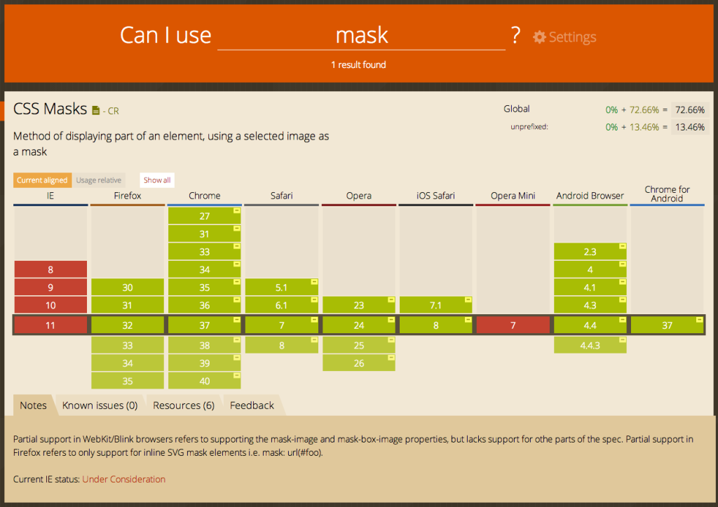
CSS clipping masks are not supported
If you relied on the mask-image property to create a loader element like me, be aware that IE has never supported it, and it still doesn’t, so you will need a transparent png fallback :
Shading effects with font icon are not possible
The technique I used so far to simulate bevel effect on font icons consist on duplicating the symbol with a pseudo-element, setting it’s color property to transparent in order to make visible only the color from the text-shadow property with a slight blur effect applied.
Well on Explorer, regardless of the version, this effect does not work because if you set a blur value for the text-shadow property the opacity of the element will be ruled by the alpha value of the color property, intuitive eh?
[codepen_embed height=300 theme_id=1 slug_hash=’Arhtf’ user=’srescio’ default_tab=’css’ animations=’run’]
Texts within interactive elements are selected too quickly
A quite annoying behavior is when tapping an item which corresponds to an action, if the touch falls exactly on the text inside the words are immediately highlighted for copying. It can be inhibited by using the user-select property.
.some-element {
   -ms-user-select: none;
}
Developer Tools, 404
 If you’ve had a strong stomach to read up to here thinking that “ok, there are many problems to solve, but there will also be native tools for debugging“, I have to disappoint you, we’re back in the days of IE6 where the best debugging tool was the F5 key.
To date there is not a native tool of MicroSoft to inspect the DOM in Explorer mobile nor there is a JavaScript REPL to figure out if something goes wrong, the only valid instrument currently is weinre, recently made compatible for Windows Phone, with all its benefits and restrictions (no breakpoints, no CSS pseudo-elements support etc).