
Anno domini 2014, pocket devices have reached the power level of common personal computers if not superior, but low cost airline companies use the atomic mass as unit of measure to check the weight of the hand luggage, which means I have to make a choice: the clothes necessary to survive the cold of Sweden (yes, in August) *or* my laptop.
I go for the drastic one, the laptop will stay home for the holiday, then I take off.

I’ve reached my destination, and during an idle time I come up with an idea for a new article, but my trusted laptop is 1800km far away in Rome … but it’s 2014, and a Galaxy Note 2 has got everything it takes to take on a simple task such as word processing, right?
Well no
We’re talking about WordPress 3.9 web and it’s mobile responsive interface for the backend admin panel to make contents. If you start drafting an article with an Android device, using Google Chrome meaning the ultimate browser when it comes to web standards, these are some of the difficulties you will stumble upon your way to the publish button.
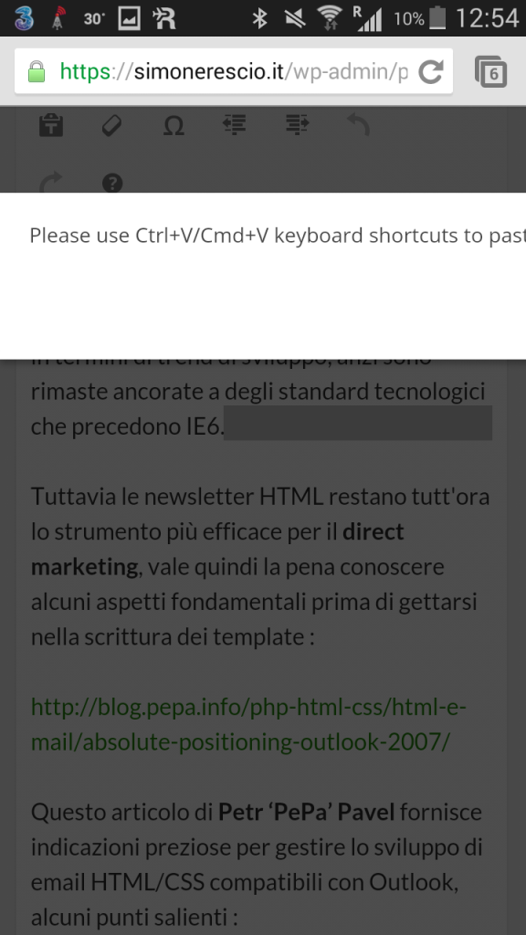
Impossible to paste formatted text
Maybe you want to quote something from the web, or a first draft was done in EverNote and something else was written in Gdrive, you may want to paste already formatted text in the visual editing tab to tweak contents later.
If you taphold in the point where you want to past things and then hit the paste command you will face an error popup advising to use a physical keyboard shortcut, the “please” is just for saying as there is no actual choice here.
The only way around this error is to use the text only tab, which means we’ll be losing all bolds and stuff, including hyper links.
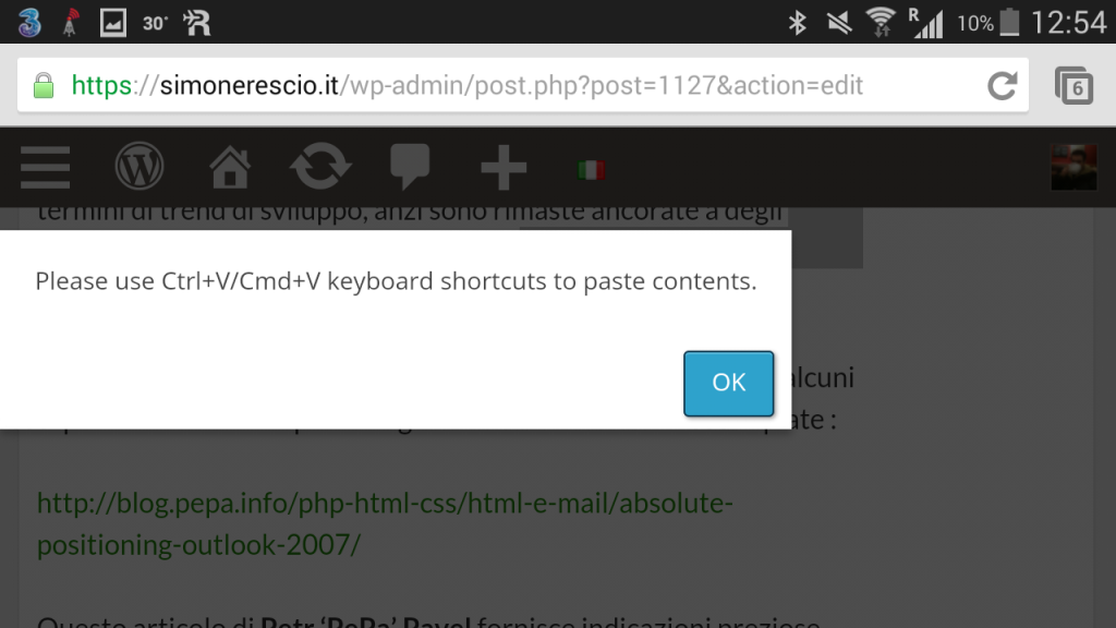
Error popup blocking with no way out
The error popup about the paste operation is a blocking modal, meaning that until you tap the OK button you won’t be able to do anything, but the popup box has a fixed width and more importantly is position:fixed which means there is no way to scroll horizontally and reach the button.
The Note 2 is big enough to display the button when rotating the device in landscape, but what would happen on a smaller device? The only option would be to navigate back the browser’s history, thus losing all work done so far, much blasphemy goes here.
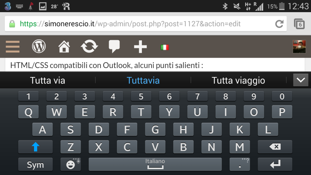
Writing in landscape is impossible, the smartphone is mistook for a tablet
Virtual keyboards do a great job guessing which key you want to press given that there isn’t enough space to display a key as big as a thumb, thus a certain amount of error is in place because keys are really close to one another.
With landscape keyboard error possibility drops considerably thanks to wider keys that are easy to press with both thumbs, which is more usable to draft faster a text that is longer than an SMS or a tweet, so I confidently tap the content’s textarea , rotate the Note and I’m about to faint:
The header that in portrait mode was in position:absolute is now fixed, stealing away the little vertical space available, which is due to the smartphone breakpoint being set to a maximum of 600px of window width, a size that a 5,5, inches smartphone can easily overcome in landscape mode, only that the vertical space available is not 1000px but less than 400px.
Other than checking the window width it would be best to also check the orientation that for media queries is based anyway on the ratio between height and width meaning it can confirm that the given width belongs to a tablet, and thus if there is enough vertical space to accommodate sticky elements.
Width and orientation together to check the device type are the only lifeline in a market where smartphones and tablets borderline gets blurred.
If we want to be even more meticulous we could also cross check the window’s aspect-ratio to handle the interface when the virtual keyboard shows up.
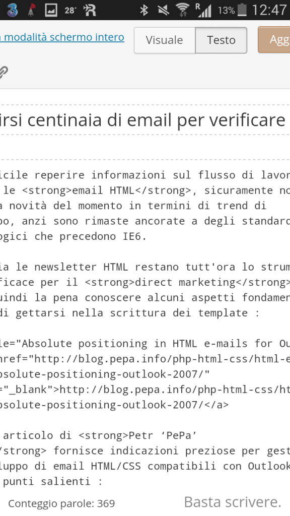
Having to scroll both page and textarea is confusing
The height of the textarea is bigger than the windows, which implies that to see all contents I found asking myself many times if I had to scroll the page, the textarea or both.
Using viewport units it’s possible to make the textarea height never exceed the browser’s height, this way once centered the textarea we can scroll just one thing:
it’s not compatible with oldest versions of the Android stockbrowser predating kitkat, yet giving a chance to the users of the other browsers that can be installed freely isn’t better than nothing?
Full screen edit view is not optimized
I get hold of myself from the chock of the landscape keyboard, get back to portrait and go for the last hope, the full screen edit view, which disappoints me right away :
The page must be scrolled horizontally in order to see a whole line of text, the top bar is way too much big, also it still displays the title field which is kind of unnecessary in this context.
But there is a good tip in the right bottom corner: “Stahp writing.“.
Yes because this interface crafted with media queries makes it useless to trick the server with the user-agent, there is no way to see the desktop version.
Unfortunately to make “mobile” a web resource targeted to productivity, such as the WordPress backend admin panel, getting everything on a straight column with float:none is not enough.
Usability should come before the aesthetic, even if the design looks great on photoshop or in the narrowed desktop browser, truth can be painfully different for the user that tries to get some work done without a computer.
And the Android app?
It displays only the articles matching the language the CMS was installed with, users that have a multi language blog like me using polylang are left empty-handed.
Will you write again a WordPress post using a smartphone?
No.