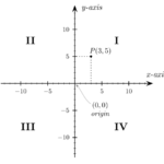
 Each system needs coordinates and references rules, when speaking of two dimensional systems we have for the Cartesian one a source point starting from which the elements grow positively to the right and upwards, if you remove height units you move down.
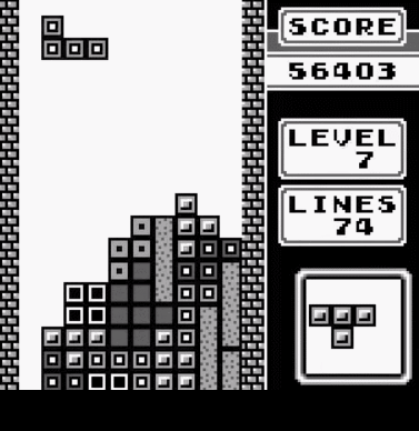 Take for example the famous puzzle game Tetris, as the blocks pile up, when a row is completed and totals a score, that row being removed will cause a shift of the above elements downward, let’s say that its gravity system is facing downward, is that the case as well in a web page in your browser?
Gravity in the browser is facing upward
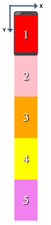 The origin-point of reference in the browser is the top-left corner from which the page starts growing down, it follows that if you scroll a big document, or better known with more contemporary noun as webapp, like a social timeline as facebook or twitter, anything that is removed or added on top of the currently “framed” content will cause a sudden change of the on-screen displayed content because everything shifts accordingly.
It is not the best from the UX point of view, and indeed becomes particularly annoying on mobile.
Adjusting the scroll position with page’s height delta
If the elements that are modified above visible area of the viewport are not subject to animations or transitions on their height, it is possible to “compensate” for this displacement by calculating the visual difference with the size change that occurred in the overall page’s height and applying the difference to the scroll position:
function isInViewportOrAbove($element, className) {
var domNode = $element.get(0),
nodeCoordinates;
// Node must be rendered on page to get its coordinates
if (!$element.is(":visible")) {
$element.removeClass(className);
nodeCoordinates = domNode.getBoundingClientRect();
$element.addClass(className);
} else {
nodeCoordinates = domNode.getBoundingClientRect();
}
return nodeCoordinates.top < $(window).height();
}
function compensateScrollDifference(previousDocumentHeight) {
var currentDocumentHeight = $(document).height(),
documentHeightDelta = previousDocumentHeight - currentDocumentHeight,
currentScrollPosition = $(document).scrollTop(),
newScrollPosition = currentScrollPosition - documentHeightDelta;
$('html, body').scrollTop(newScrollPosition);
}
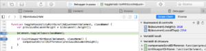
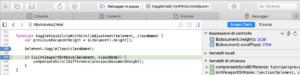
function toggleVisibilityWithScrollAdjustment($element, className) {
var previousDocumentHeight = $(document).height();
$element.toggleClass(className);
if (isInViewportOrAbove($element, className)) {
compensateScrollDifference(previousDocumentHeight);
}
}
Chrome natively manages changes over the viewport
 Thanks to the fact of having accompanied the above functionality with lots of different Jasmine unit tests, I found that this feature has started to malfunction in Chrome from February 8th, in connection with the release of version 56.
The test asserts that given a page 3000px tall with the scroll position set to 1800px, when toggling an upper element with height of 100px using the above function then the page scroll position would become 1700px, yet on Chrome after the update position started being reported as 1600px, like it was applied twice.
By setting a breakpoint in conjunction with the toggle of the class and before calling the function to correct the scroll offset we can observe that while all other browsers after applying the visibility change will keep the scroll position unchanged,
Chrome instead immediately after the toggle has already corrected the scroll position by itself, so running our own function would be harmful.
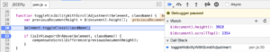
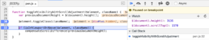
So we need to check if the browser has already made changes on the scroll position to compensate for changes occurred in the page, to decide whether to act or not:
function toggleVisibilityWithScrollAdjustment($element, className) {
    var previousDocumentHeight = $(document).height(),
        preToggleScrollPosition = $(document).scrollTop(),
        postToggleScrollPosition,
        isScrollPositionUnchanged;

    $element.toggleClass(className);

    postToggleScrollPosition  = $(document).scrollTop();
    isScrollPositionUnchanged = preToggleScrollPosition === postToggleScrollPosition;

    if (isScrollPositionUnchanged && isInViewportOrAbove($element, className)) {
        compensateScrollDifference(previousDocumentHeight);
    }
}
Chrome’s native mechanism is particularly advanced as it works for animated items, just select an image for example in the inspector tag and scroll down to make it disappear high above the viewport, then changing in any way its height will not affect the position of contents in the current viewport.
This is just yet another reminder that cross browser issues are far from being extinct on front end.