I know why you’re here, I’ve gone through this as well. Like me you created a container box with dynamic height, 100%, and inside it you want some columns that reside near each other, occupying the same height of their parent, 100% them too.
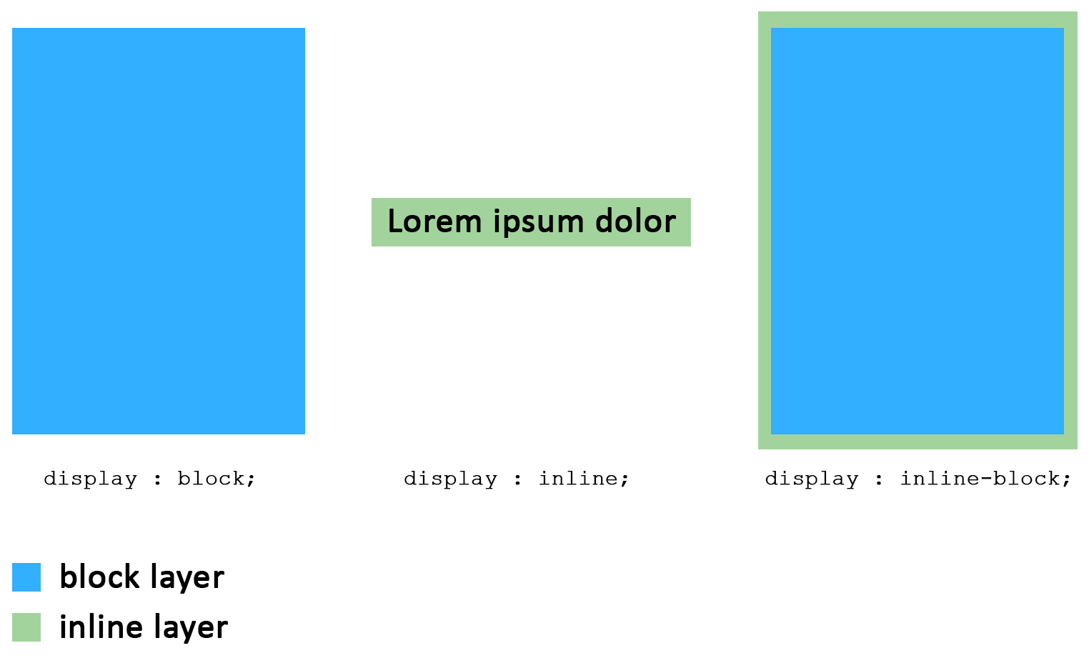
Now assumed that the display attribute block does not accept to visually reside near other elements horizontally and that inline does, but doesn’t respect any dimension attribute, what can we do? Use both of them, display inline-block to get the best of both worlds.
But something strange happens, our columns now do reside near each other on the same line, but they are surrounded on the bottom and right side by a mysterious 4px space.
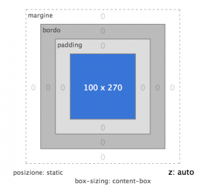
 Hand to firebug, inspect element … nothing, there’s absolutely nothing that seems to justify the presence of that space, the graphic on the Layout tab speaks for himself, margin 0, border 0, padding 0, there is only the computed space of the content itself. A quick peek to check our HTML and it’s completely clean, no random   or wrong formatting, then where does that empty space comes from? Why is it there? And why is it driving us to madness? 🙁
If we go back on our logical steps we will find a hint, we needed visual behavior of type block for the height, but we also needed inline visual behavior for the horizontal position of the box but together with this we inherited an unclear side-effect.
The majority of HTML tags with inline behavior belongs to the domain of elements appointed to the depiction of text on the page in its numerous semantic variations, these elements to compute the amount of space they will take in the document are ruled by the algorithms that take effect on text space amount, like the font-size.
It naturally happens that every element that receives the property display inline-block will be partially ruled for its screen space amount by these factors that are not inspectable with any developer tool.
Like stated on the official W3C guide in the display section :
inline-block
Causes an element to generate an inline-level block container. The inside of an inline-block is formatted as a block box, and the element itself is formatted as an atomic inline-level box.
This means that the inner content will respect the 100% height as instructed, but will also be surrounded by an anonymous text node that is ruled by text-type properties applied to the parent element or any one of its ancestors, while the inner content keeps being ruled by block type properties, like the name succession suggests.

The best way to make text completely disappear is to shrink it until it is annihilated, with the following SASS :
/* Remove the ghost spaces, but breaks font-size inheritance chain */
.inlineFix {
  font-size: 0px;

  /* Restore font-size inheritance chain */
  * {
    font-size: 16px;
  }
}
where the class must be given to the parent container of the inline-block elements, this way the text space represented by the inline part surrounding our columns will be nullified. Using the universal selector we then restore the normal font-size inside all the other children to not make content that doesn’t have its own properties disappear, as it would search for them in the inheritance chain of its ancestors.
This method is useful especially to handle the behaviour of layout-level macro elements that are the only children of their parent, in the case that the usage of floats is not an option.
Another workaround I found on the net refers to the usage of the vertical-align: top property always applied to the parent element, which effectively deals with the bottom space, but not the one on the sides when elements are aligned horizontally. Try to play around with the font-size fix to see how the space between the columns change, interesting huh? 🙂
