What “Absolute” means
Let’s start with a foreword on the main term of the subject, because as many things CSS names can be misleading in many ways. So first thing position: absolute; doesn’t mean “absolute” in the natural language way, it’s not like an element with this property stops being tied to anything at all, rather we should look at the latin origin of the word that is:
ab + solutus = untied
So what is the element being untied from exactly? That is its positional content flow context, the one each element posses when rendered on the page with no position property specified, which default is static, based on where the tags are declared in the HTML source.
Clutter and Coordinates of an element
Given that the coordinate’s origin of each element spawn from the top-left corner of its render-box and expand to bottom-right directions, the position-related properties that shift an element, as well as other context-dependant properties or values like percentage values in height or similar, that are top, right, bottom and left based on the applied position value will spawn from:
- static: nothing, the element won’t move
- relative: the element’s own borders, element’s clutter on the page is unaffected
- absolute: the borders of the first ancestor with position value different from static
- fixed: the visible viewport’s borders
 With both
absolute and
fixed the element is effectively removed from the regular content flow as all other surrounding content re-flows as if the element was “deleted” and it doesn’t produce clutter anymore.
Still there is one behavior to notice with absolute, which is that if no positioning properties are applied, the element’s render-box will start moving upward, like when a balloon string is cut loose and it starts flying away till it hits the ceiling, and its coordinate origin will lean against the bottom of the first element that takes up space on the page with its own clutter, eg a not floated block-level element, which may be a sibling element even if empty, or the top border of it’s parent container if nothing else is met on its journey upward.
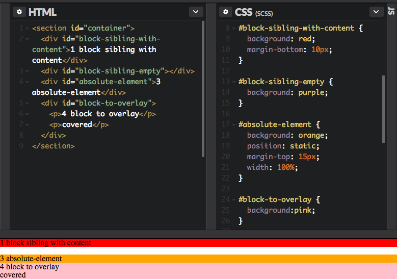
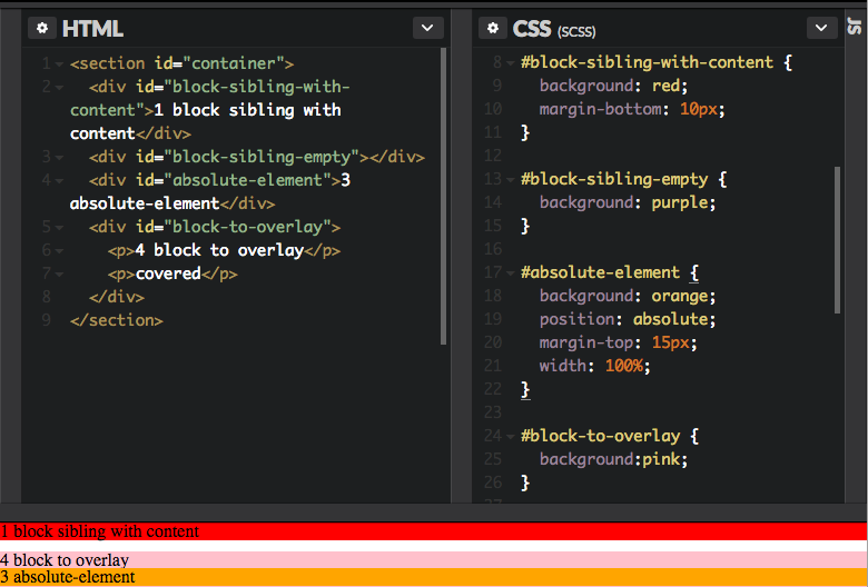
So let’s say we have four block-level elements, three of them have content, the second one doesn’t and we want to move third one over the fourth:
so we use position: absolute; on the third orange element and nudge it away from the empty second element, which is pushed down by the first red row, so we move it on top of the fourth pink element.
From this stage it’s possible to play around with the current position of the element using the margin property that will act out of the element’s coordinate’s origin, as it would do also in position: static; only that now being out of the flow it will not affect anything but itself in it’s current new spot.
All good, till you hit Android’s stock browser
Unfortunately, many low-end Android tablets and phones still ship with the so called Internet app that are powered by very legacy versions of webkit, and the version is different for almost every device depending on which date it was produced, it never gets updated and we still have to live it.
On these engines, if the aforementioned block level sibling is empty, it will be effectively ignored and the margin-shifted element will appear way off the intended point, and no force-repaint via display toggle will do as it’s essentially the reference point being different, still the issue can be dealt with in two ways.

Apply the position property via JS
If the position: absolute; property is applied at runtime via JS after landing rendering with another position value or no one at all, in this case for some mysterious reason it will then reference the empty element correctly as in all other browsers engines, still resorting to a JS hack for a CSS quirck feels like a big overkill, that is if a CSS alternative exist and we’re lucky.
Provide fake content to the empty sibling
Since the issue is the top element of the node’s sandwich being empty we can bring temporary content to it via CSS pseudo selector and pseudo content to fool the engine like:
|
1 2 3 4 5 |
#placeholder-before-absolute:empty:after { content: ''; display: block; height: 1px; } |
It would be possible to use the wildcard * selector to not think too much about it, but this could come with consequences on the layout, and because retro-selectors don’t exist we’re left with having to find the incriminated element and address it precisely.
Another variation of the above could be targeting the direct children of specific containers to restrict the selector range and still deal with situations like when there are variable sections, placeholders and dynamic content, or if we don’t have an ID hook for the elements, in order to reduce the side effects on other parts of the page as much as possible.


